The ABCs of Effective Children's Book Design

After you have written and edited your children’s book, read this first!
No matter how great your story and characters are, poor children’s book design and illustrations will limit your success—and sales—when self publishing children’s books.
Even if you are planning to work with design and illustration professionals (highly recommended!), knowing the main building blocks of children’s book design will help you self publish a winner.
How to Effectively Plan Your Children’s Book Design
Research
Take a trip to your local library or bookstore to review the latest bunch of children’s books aimed at your book's age group, especially the award-winners. This will help you identify the current trends in children’s story books, including editorial tone, cover design, page design, and illustration.
Your children’s book needs to connect with the kids of today. Kid’s books from 30 years ago are quite different from what currently engages children. Children are exposed to so much more these days, and can understand deeper themes and complex art.
That being said, there are still the “classics” that have been around forever and seem to connect with every new generation of little people. What is it about these books that enable them to stand the test of time?
And, don’t forget that your kids picture book needs to appeal to the adults and parents who will help choose and read the book.
Storyboard
Think of your picture book like a movie for kids. How will you unfold the story page by page with images that bring the text to life? Where are the important moments in the story that can benefit from a larger visual treatment—like a two-page spread?
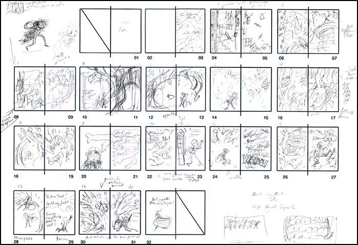
This is where a storyboard comes in. It’s essentially a rough outline of your children’s book done as a small mockup with rough image drawings. If you are working with an illustrator, you can collaborate on a storyboard to figure out the pacing of your story and strong image ideas.

The above example is from John Shelley's creepily beautiful Halloween Forest. See how John's childrens book design came to life by reading his design blog.
You can find countless children’s book storyboard templates on the Web. On her resourceful Inky Girl website, children’s book writer and illustrator Debbie Ridpath Ohi provides free downloads of picture book thumbnail templates.
Note that the usual length for a children’s book is 24 or 32 pages—a multiple of 8 or 12. Other page counts can be more expensive to produce if they are not divisible by 8 or 12. The printer will need to manually insert pages rather than bind the book automatically by machine.
Images
Images (usually illustrations) are a crucial element of kids book design. There are many different styles of illustration. The trick is to match the emotional feel of your subject with an illustrator/art style that complements your story.
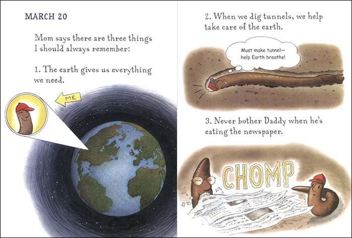
In Diary of a Worm (By Doreen Cronin and Harry Bliss), the warm and whimsical children’s book illustrations aptly depict the daily life of an eager, young worm.

If your book is for younger children, aim for a simpler illustration style. If your book is for older children, aim for more abstract art.
If you’re in the market for a children’s book illustrator or want to explore different illustration styles, a good place to start is www.picture-book.com. Depending on their level of experience, illustrators charge anywhere from under $100 per illustration to several hundred dollars per illustration.
Work will probably take between 3 to 6 months to complete, depending on the image complexity and the illustrator’s production schedule.
Layout, Colors, and Typefaces
If you don’t use a storyboard, you’ll probably end up with a boring children’s picture book layout (text on one side, image on the other side).
To mix things up in your layout, plan to have images that spread across two pages, and text placed above, below, around, or between images. You can break up lines of text and place them over a full-page illustration. Just make sure that the text is placed over a mostly uniform dark or light area where it will be easily legible.
Check that important elements of your illustrations (like a main character’s face) don’t get lost in the crack between a two-page spread—or too close to the page edge and get cut off. Leave a safety margin of ¼ inch for any nonbleeding images, and 3/8 inch for text.
Just as illustrations connect emotionally with the story, your color and typeface choices also need to reflect your subject matter.
What color scheme will enhance the mood of your story? A natural mood can be created with earthy, warm colors like brown and green. A warm mood may combine red, orange, and yellow. An exciting mood will use strong color contrasts like red and purple.
In Diary of a Worm, the colors are warm and earthy nature tones.
To learn all about the basics of color, Canva (simple graphic design software) offers a good color primer on their website.
Every typeface has a personality, a “voice.” If your book could talk, what would it sound like? Now, try to choose a typeface that sounds like how it looks! You also need to consider your audience. A children’s picture book will be read by both adults and children. The typefaces can be creative where possible, but never to the point where the text becomes illegible.
To learn more about different typeface styles and how to use typefaces, visit Fonts.com.
Cover
We all have fond memories of our favorite children’s books and probably remember the front cover most of all!
Everyone (children especially) DO judge a book by its cover. Your children’s book cover needs to instantly attract kids and parents to pick up and learn more about your book. Quite simply, a great cover will sell more books.
Dos for great children’s book cover design:
- Know the age group of your young audience and target the cover design to them
- Design the book title in an interesting way and make sure it stands out
- Ensure that your front cover image gives readers a preview of the story inside, and creates curiosity
- Choose colors and typefaces that match the mood of the story
- Don’t try to reinvent the wheel. Make sure your children’s book cover is designed in the spirit of other children’s books. If it’s too avant-garde, your audience won’t know what to make of your book, and probably won’t buy it.
Study front covers from acclaimed children’s book publishers and make notes about what you like and why they stand out.

Take a look at more covers of award-winning children’s books on Amazon.
If you don’t have any experience with design, it’s best to leave the cover to a professional book designer. An unattractive, amateur cover can spell disaster for your book.
The best written, designed, and illustrated books for kids capture their imagination from start to finish. Once you reach the last page of your children’s book and hear, “Read it again,” you know you have created something special!
———
Are you one of the many authors who are self publishing children's picture books? In business for 23 years, Callawind Book Publishing offers complete self publishing services for children’s book publishing, including graphic design for children's books. Please visit our website at www.callawind.com.